Introduction
Designing for Spencers/Spirit made less complicated and more defined.
Overview
As a team, the Spencers/Spirit Ecommerce branch works to create high-quality online experiences for our customers. Constantly adding new products, new promotions, and new pages to meet the newest trends and keep the company growing.
Design Principles
When designing a page, our focus is creating an experience that is not only looks good, but is easy to use for all people on all devices; with extra steps taken for it to be accessible to those with disabilities. This is accomplished with thorough testing and creative design, and most importantly by following design best practices and meeting web accessibility standards.
Components
Components are building blocks for a page. They can be anything from an interactive button to a static image, anything on the page is a component. Breaking pages down into these components allows for a more defined style, which can be carried across all pages made for the website.
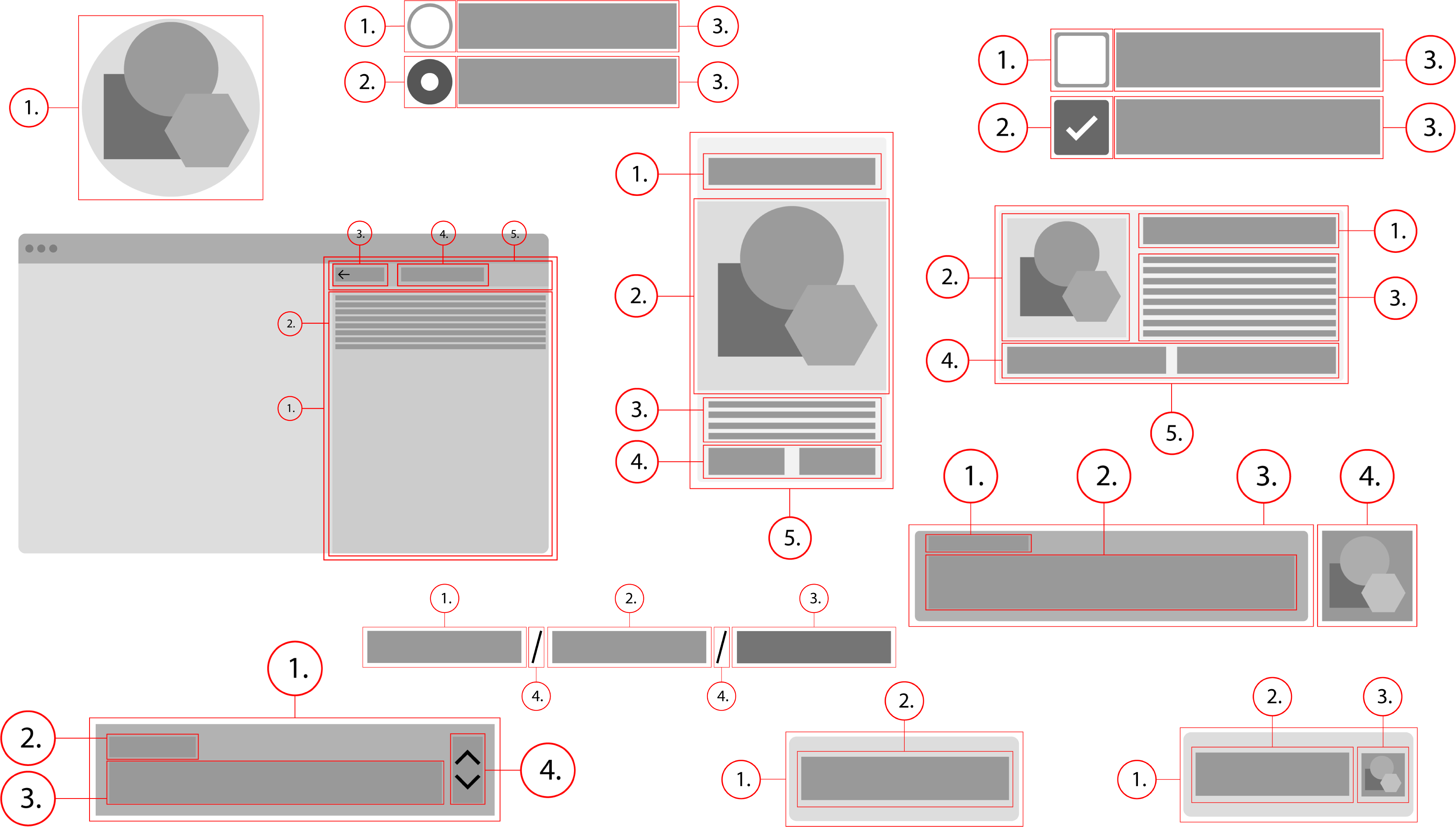
Components cover a range of needs, including:
1. Display: Placing and organizing content using components like cards, lists, or modals
2. Navigation: Allowing users to move through the product using components like Breadcrumbs or Menus
3. Actions: Allowing users to perform tasks using components such as buttons
4. Input: Allowing users to enter information or make selections using components like text fields or checkboxes
5. Communication: Alerting users to key information and messages using components such as snackbars, banners, or dialogs
Theming
The components used on spencers and spirit should ideally be the same. The only difference between them would be the theming. Theming has to do with altering aspects of the design to match the look and feel of the brand. This would change things such as background, border, or text color, for example.