Buttons - Design
Buttons allow users to interact with the site.
Live Demo
Flat
Raised
Dense
Compact
Checkout
Usage
All the different buttons seen in the demo above are modifiers on the first one seen at the top left of the demo. The modifiers are secondary, primary, icon, raised, dense, compact, and checkout. Most of these modifiers can be mixed together, such as a raised primary icon button or a dense checkout button. Although its possible, try not to mix modifiers in ways not displayed in the demo unless necessarry.
Anatomy
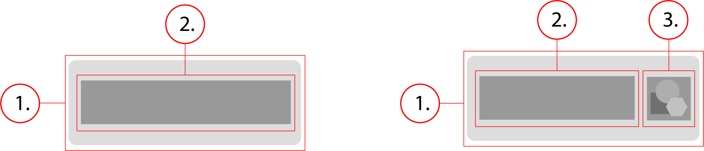
2. Button Text
3. Button Icon
Behavior
Buttons have a minimum width of 88px and stretch horizontally to fit the content of the button. They are 36px tall unless a modifier changes this, such as dense or compact. Buttons background color darkens slightly when hovered upon, and then it darkens even more on click.
Buttons - Implementation
Buttons allow users to interact with the site.
Basic Button
The basic button with no modifiers would look like the demo below. It looks like its just plain text but thats because it has no background and no border. The only way you can tell its a button is when you hover over it or click it. Underneath the demo is the html and css for this defualt basic button
<button class="btn" type="button"> Button </button>.btn {
-webkit-tap-highlight-color: transparent;
font-size: 0.875rem;
font-weight: 500;
letter-spacing: 0.04em;
line-height: 1.875rem;
text-decoration: none;
text-transform: initial;
display: inline-flex;
align-items: center;
justify-content: center;
position: relative;
min-width: 88px;
height: 36px;
padding: 0 16px;
border: none;
border-radius: 3px;
outline: 0;
background-color: transparent;
overflow: hidden;
cursor: pointer;
-ms-touch-action: manipulation;
touch-action: manipulation;
-webkit-user-select: none;
-moz-user-select: none;
-ms-user-select: none;
user-select: none;
-webkit-appearance: none;
appearance: none;
}
.btn:focus,
.btn:hover {
background-color: #f2f2f2;
}
.btn:active {
background-color: #e5e5e5;
}Primary
The primary button is just a basic button with the btn--primary modifier.
<button class="btn btn--primary" type="button"> Button </button>.btn {
-webkit-tap-highlight-color: transparent;
font-size: 0.875rem;
font-weight: 500;
letter-spacing: 0.04em;
line-height: 1.875rem;
text-decoration: none;
text-transform: initial;
display: inline-flex;
align-items: center;
justify-content: center;
position: relative;
min-width: 88px;
height: 36px;
padding: 0 16px;
border: none;
border-radius: 3px;
outline: 0;
background-color: transparent;
overflow: hidden;
cursor: pointer;
-ms-touch-action: manipulation;
touch-action: manipulation;
-webkit-user-select: none;
-moz-user-select: none;
-ms-user-select: none;
user-select: none;
-webkit-appearance: none;
appearance: none;
}
.btn:focus,
.btn:hover {
background-color: #f2f2f2;
}
.btn:active {
background-color: #e5e5e5;
}
.btn--primary {
color: #fff;
border: 1px solid;
border-color: #5d87de #3367d6 #285bc7;
background-color: #4877da;
}
.btn--primary:focus,
.btn--primary:hover {
background-color: #3367d6;
}Secondary
The secondary button is just a basic button with the btn--secondary modifier.
<button class="btn btn--secondary" type="button"> Button </button>.btn {
-webkit-tap-highlight-color: transparent;
font-size: 0.875rem;
font-weight: 500;
letter-spacing: 0.04em;
line-height: 1.875rem;
text-decoration: none;
text-transform: initial;
display: inline-flex;
align-items: center;
justify-content: center;
position: relative;
min-width: 88px;
height: 36px;
padding: 0 16px;
border: none;
border-radius: 3px;
outline: 0;
background-color: transparent;
overflow: hidden;
cursor: pointer;
-ms-touch-action: manipulation;
touch-action: manipulation;
-webkit-user-select: none;
-moz-user-select: none;
-ms-user-select: none;
user-select: none;
-webkit-appearance: none;
appearance: none;
}
.btn:focus,
.btn:hover {
background-color: #f2f2f2;
}
.btn:active {
background-color: #e5e5e5;
}
.btn--secondary {
background-color: #f2f2f2;
border: 1px solid;
border-color: #f5f5f5 #e5e5e5 #d9d9d9;
}
.btn--secondary:focus,
.btn--secondary:hover {
background-color: #e5e5e5;
}
.btn--secondary:active {
background-color: #d9d9d9;
}Icon
The icon button is just a basic button with an svg of class "icon" in it, along with the button text.
<button class="btn" type="button">
<svg class="icon" role="presentation" focusable="false" viewBox="0 0 24 24">
<path d="M20 11v2H8l5.5 5.5-1.42 1.42L4.16 12l7.92-7.92L13.5 5.5 8 11h12z"/>
</svg>
Button
</button>.btn {
-webkit-tap-highlight-color: transparent;
font-size: 0.875rem;
font-weight: 500;
letter-spacing: 0.04em;
line-height: 1.875rem;
text-decoration: none;
text-transform: initial;
display: inline-flex;
align-items: center;
justify-content: center;
position: relative;
min-width: 88px;
height: 36px;
padding: 0 16px;
border: none;
border-radius: 3px;
outline: 0;
background-color: transparent;
overflow: hidden;
cursor: pointer;
-ms-touch-action: manipulation;
touch-action: manipulation;
-webkit-user-select: none;
-moz-user-select: none;
-ms-user-select: none;
user-select: none;
-webkit-appearance: none;
appearance: none;
}
.btn:focus,
.btn:hover {
background-color: #f2f2f2;
}
.btn:active {
background-color: #e5e5e5;
}
.btn .icon {
width: 24px;
height: 24px;
fill: #212121;
}Raised
The raised button is just a basic button with the btn--raised modifier.
<button class="btn btn--raised" type="button"> Button </button>.btn {
-webkit-tap-highlight-color: transparent;
font-size: 0.875rem;
font-weight: 500;
letter-spacing: 0.04em;
line-height: 1.875rem;
text-decoration: none;
text-transform: initial;
display: inline-flex;
align-items: center;
justify-content: center;
position: relative;
min-width: 88px;
height: 36px;
padding: 0 16px;
border: none;
border-radius: 3px;
outline: 0;
background-color: transparent;
overflow: hidden;
cursor: pointer;
-ms-touch-action: manipulation;
touch-action: manipulation;
-webkit-user-select: none;
-moz-user-select: none;
-ms-user-select: none;
user-select: none;
-webkit-appearance: none;
appearance: none;
}
.btn:focus,
.btn:hover {
background-color: #f2f2f2;
}
.btn:active {
background-color: #e5e5e5;
}
.btn--raised {
transition: box-shadow 90ms cubic-bezier(0.4, 0, 0.2, 1);
box-shadow: 0 2px 5px 0 rgba(0, 0, 0, 0.26);
}
.btn--raised:active {
box-shadow: none;
}Dense
The dense button is just a basic button with the btn--dense modifier.
<button class="btn btn--dense" type="button"> Button </button>.btn {
-webkit-tap-highlight-color: transparent;
font-size: 0.875rem;
font-weight: 500;
letter-spacing: 0.04em;
line-height: 1.875rem;
text-decoration: none;
text-transform: initial;
display: inline-flex;
align-items: center;
justify-content: center;
position: relative;
min-width: 88px;
height: 36px;
padding: 0 16px;
border: none;
border-radius: 3px;
outline: 0;
background-color: transparent;
overflow: hidden;
cursor: pointer;
-ms-touch-action: manipulation;
touch-action: manipulation;
-webkit-user-select: none;
-moz-user-select: none;
-ms-user-select: none;
user-select: none;
-webkit-appearance: none;
appearance: none;
}
.btn:focus,
.btn:hover {
background-color: #f2f2f2;
}
.btn:active {
background-color: #e5e5e5;
}
.btn--dense {
padding: 0 8px;
font-size: 0.875rem;
line-height: 1rem;
height: 32px;
}Compact
The compact button is just a basic button with the btn--compact modifier.
<button class="btn btn--compact" type="button"> Button </button>.btn {
-webkit-tap-highlight-color: transparent;
font-size: 0.875rem;
font-weight: 500;
letter-spacing: 0.04em;
line-height: 1.875rem;
text-decoration: none;
text-transform: initial;
display: inline-flex;
align-items: center;
justify-content: center;
position: relative;
min-width: 88px;
height: 36px;
padding: 0 16px;
border: none;
border-radius: 3px;
outline: 0;
background-color: transparent;
overflow: hidden;
cursor: pointer;
-ms-touch-action: manipulation;
touch-action: manipulation;
-webkit-user-select: none;
-moz-user-select: none;
-ms-user-select: none;
user-select: none;
-webkit-appearance: none;
appearance: none;
}
.btn:focus,
.btn:hover {
background-color: #f2f2f2;
}
.btn:active {
background-color: #e5e5e5;
}
.btn--compact {
padding: 0 6px;
font-size: 0.75rem;
line-height: 1rem;
height: 24px;
}Checkout
The checkout button is just a basic button with the btn--checkout modifier, and you can apply a raised modifier to it if needed.
<button class="btn btn--checkout" type="button"> Button </button>
<button class="btn btn--checkout btn--raised" type="button"> Button </button>.btn {
-webkit-tap-highlight-color: transparent;
font-size: 0.875rem;
font-weight: 500;
letter-spacing: 0.04em;
line-height: 1.875rem;
text-decoration: none;
text-transform: initial;
display: inline-flex;
align-items: center;
justify-content: center;
position: relative;
min-width: 88px;
height: 36px;
padding: 0 16px;
border: none;
border-radius: 3px;
outline: 0;
background-color: transparent;
overflow: hidden;
cursor: pointer;
-ms-touch-action: manipulation;
touch-action: manipulation;
-webkit-user-select: none;
-moz-user-select: none;
-ms-user-select: none;
user-select: none;
-webkit-appearance: none;
appearance: none;
}
.btn:focus,
.btn:hover {
background-color: #f2f2f2;
}
.btn:active {
background-color: #e5e5e5;
}
.btn--checkout {
color: #fff;
background-color: #088921;
}
.btn--checkout:focus,
.btn--checkout:hover {
background-color: #07761d;
}
.btn--checkout:active {
background-color: #07761d;
}
.btn--checkout.btn--raised {
transition: box-shadow 0.3s cubic-bezier(0.4, 0, 0.2, 1);
box-shadow: 0 2px 5px 0 rgb(0 0 0 / 26%);
}All CSS
The combined CSS for all buttons and modifiers.
.btn {
    -webkit-tap-highlight-color: transparent;
    font-size: 0.875rem;
    font-weight: 500;
    letter-spacing: 0.04em;
    line-height: 1.875rem;
    text-decoration: none;
    text-transform: initial;
    display: inline-flex;
    align-items: center;
    justify-content: center;
    position: relative;
    min-width: 88px;
    height: 36px;
    padding: 0 16px;
    border: none;
    border-radius: 3px;
    outline: 0;
    background-color: transparent;
    overflow: hidden;
    cursor: pointer;
    -ms-touch-action: manipulation;
    touch-action: manipulation;
    -webkit-user-select: none;
    -moz-user-select: none;
    -ms-user-select: none;
    user-select: none;
    -webkit-appearance: none;
    appearance: none;
}

.btn:focus,
.btn:hover {
    background-color: #f2f2f2;
}

.btn:active {
    background-color: #e5e5e5;
}
.btn:disabled {
color: rgba(0, 0, 0, 0.38);
cursor: default;
pointer-events: none;
}
.btn .icon {
width: 24px;
height: 24px;
fill: #212121;
}
.btn--raised {
transition: box-shadow 90ms cubic-bezier(0.4, 0, 0.2, 1);
box-shadow: 0 2px 5px 0 rgba(0, 0, 0, 0.26);
}
.btn--raised:active {
box-shadow: none;
}
.btn--dense {
padding: 0 8px;
font-size: 0.875rem;
line-height: 1rem;
height: 32px;
}
.btn--compact {
padding: 0 6px;
font-size: 0.75rem;
line-height: 1rem;
height: 24px;
}
.btn--primary {
color: #fff;
border: 1px solid;
border-color: #5d87de #3367d6 #285bc7;
background-color: #4877da;
}
.btn--primary:focus,
.btn--primary:hover {
background-color: #3367d6;
}
.btn--primary:active {
background-color: #285bc7;
}
.btn--secondary {
background-color: #f2f2f2;
border: 1px solid;
border-color: #f5f5f5 #e5e5e5 #d9d9d9;
}
.btn--secondary:focus,
.btn--secondary:hover {
background-color: #e5e5e5;
}
.btn--secondary:active {
background-color: #d9d9d9;
}
.btn--checkout {
color: #fff;
background-color: #088921;
}
.btn--checkout:focus,
.btn--checkout:hover {
background-color: #07761d;
}
.btn--checkout:active {
background-color: #07761d;
}
.btn--checkout.btn--raised {
transition: box-shadow 0.3s cubic-bezier(0.4, 0, 0.2, 1);
box-shadow: 0 2px 5px 0 rgb(0 0 0 / 26%);
}