Design
Implementation
Stepper Input - Design
Stepper input lets users increment or decrement a value.
Live Demo
Usage
Stepper input is used in places where a number value is required from the user. An example use case would be selecting the quantity of a product.
Anatomy
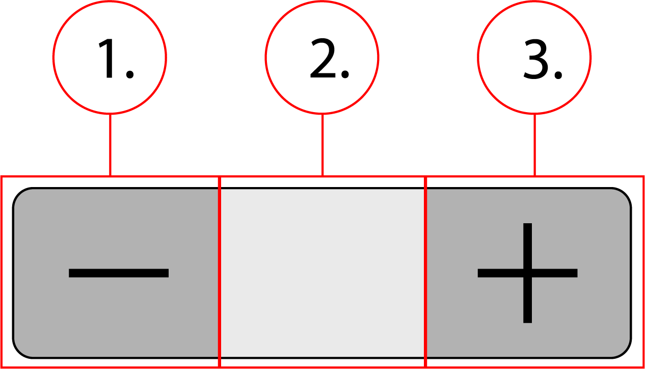
2. Number field
3. Plus button
Behavior
Stepper input has a static size, and will behave like any other element in a container.
Stepper Input - Implementation
Stepper input lets users increment or decrement a value.
Implementation
<div class="stepper" data-value="1">
    <button class="stepper__btn btn--minus" type="button" role="button" aria-label="Minus" onclick="decrement()">
        <svg class="stepper__icon" width="24" height="24" viewBox="0 0 24 24">
            <path d="M19 13H5v-2h14v2z"></path>
        </svg>
    </button>
    <label class="a11y-hide" for="quantity"></label>
    <input class="stepper__field" id="quantity" data-qaautomationid="prdct-Quantity" name="quantity" type="number" value="1" autofillparam="ON" min="1" max="99" onchange="change()">
    <button class="stepper__btn btn--plus" type="button" role="button" aria-label="Plus" onclick="increment()">
        <svg class="stepper__icon" width="24" height="24" viewBox="0 0 24 24">
            <path d="M19 13h-6v6h-2v-6H5v-2h6V5h2v6h6v2z"></path>
        </svg>
    </button>
</div>
<script>
    const input = document.getElementById("quantity")
    function increment() {
        if (parseInt(input.value) < 99) {
            input.value = parseInt(input.value)+1;
        }
    }
    function decrement() {
        if (parseInt(input.value) > 1) {
            input.value = parseInt(input.value)-1;
        }
    }
    function change() {
        if (parseInt(input.value) > 99) {
            input.value = 99
        }
        if (parseInt(input.value) < 1) {
            input.value = 1
        }
    }
</script>.stepper {
display: flex;
}
.stepper__btn {
margin: 0;
padding: 0;
height: 32px;
width: 36px;
cursor: pointer;
}
.stepper__icon {
height: 30px;
width: 24px;
}
.stepper__field {
border-radius: 0;
border-top: 1px solid #c2c2c2;
border-bottom: 1px solid #c2c2c2;
border-right: none;
border-left: none;
text-align: center;
width: 36px;
-webkit-appearance: none
}
.stepper__field::-webkit-inner-spin-button,
.stepper__field::-webkit-outer-spin-button {
-webkit-appearance: none;
-moz-appearance: none;
appearance: none;
}
.btn--minus {
border: 1px solid #c2c2c2;
border-radius: 4px 0 0 4px;
}
.btn--plus {
border: 1px solid #c2c2c2;
border-radius: 0 4px 4px 0;
}
Contents