Design
Implementation
Radio Buttons - Design
Radio Buttons are used for selecting one choice out of many.
Live Demo
Usage
Radio buttons are a variation of a checkbox that should be used when only one choice can be selected out of a set.
Anatomy
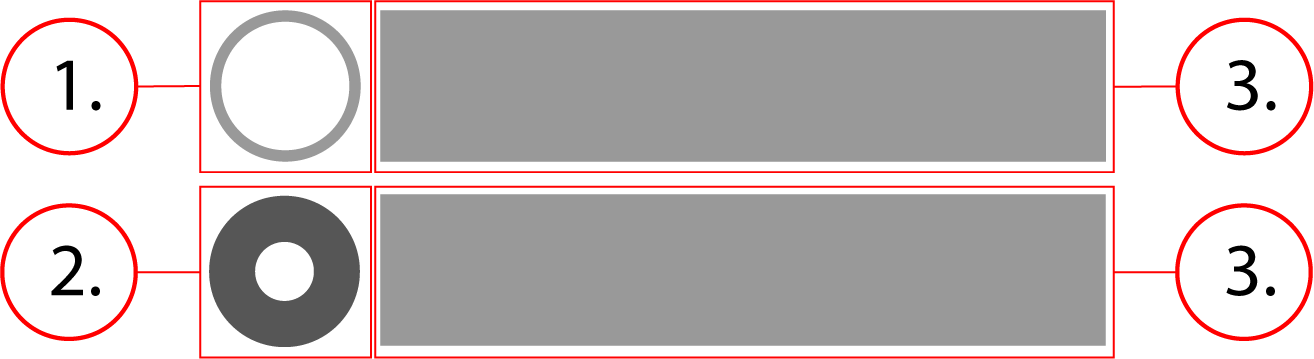
2. Checked radio
3. Option text
Behavior
The radio button stays the same size, the container scales horizontally with the option text.
Radio Buttons - Implementation
Radio Buttons are used for selecting one choice out of many.
Implementation
This is what a basic implementation of one radio button would look like, although there should always be more than one in an actual implementation. If you only need one, use a checkbox instead. Below is the HTML and CSS for a radio button implementation.
<label class="radio" id="radio-exerciserequest-label-1">
    <input class="radio__native-control" id="form-exerciserequest-radio-1" name="exerciserequest" required="" type="radio" value="Option 1" aria-checked="false" aria-labelledby="radio-exerciserequest-label-1"/>
    <div class="radio__outer-circle" />
    <span class="radio__text">Option 1</span>
</label>.radio {
font-size: .875rem;
font-weight: 400;
font-family: -apple-system, BlinkMacSystemFont, "Segoe UI", Roboto, Helvetica, Arial, sans-serif, "Apple Color Emoji", "Segoe UI Emoji", "Segoe UI Symbol";
position: relative;
display: flex;
align-items: center;
flex-direction: row;
line-height: 1;
margin-top: 6px;
margin-bottom: 6px;
cursor: pointer
}
.radio__outer-circle {
position: relative;
width: 20px;
height: 20px;
margin-right: 8px;
background-color: #757575;
border-radius: 50%;
display: flex;
align-items: center;
justify-content: center;
flex-shrink: 0;
vertical-align: middle
}
.radio__outer-circle:before {
content: '';
width: 18px;
height: 18px;
border-radius: 50%;
transition: transform 280ms cubic-bezier(.645, .045, .355, 1);
background-color: #fff
}
.radio__outer-circle::after {
position: absolute;
content: '';
width: 18px;
height: 18px;
border-radius: 50%;
z-index: 0;
opacity: 0;
transition: opacity .6s cubic-bezier(.165, .84, .44, 1);
box-shadow: 0 0 0 2px #000;
top: 1px;
left: 1px;
pointer-events: none
}
.radio__native-control {
position: absolute;
top: 0;
left: 0;
width: 100%;
height: 100%;
margin: 0;
padding: 0;
opacity: 0;
cursor: inherit;
z-index: 1
}
.radio__native-control:focus~.radio__outer-circle::after,
.radio__native-control:hover~.radio__outer-circle::after {
opacity: 1
}
.radio__native-control:checked~.radio__outer-circle {
background-color: #285bc7
}
.radio__native-control:checked~.radio__outer-circle:before {
transform: scale(-.375)
}
.radio__native-control:checked:disabled~.radio__outer-circle {
background-color: #eee
}
.radio__native-control:checked:disabled~.radio__outer-circle:before {
background-color: #afafaf
}
.radio__native-control:disabled~.radio__outer-circle {
background-color: #afafaf;
cursor: not-allowed
}
.radio__native-control:disabled~.radio__outer-circle:before {
background-color: #afafaf
}
.radio__text {
display: flex;
flex: 1 1 auto;
flex-flow: row nowrap;
font-size: 16px
}Implementing a Radio Button Group
<fieldset aria-errormessage="form-exerciserequest-message" class="radio-group">
    <label class="radio" id="radio-exerciserequest-label-1">
        <input class="radio__native-control" id="form-exerciserequest-radio-1" name="exerciserequest" required="" type="radio" value="Option 1" aria-checked="false" aria-labelledby="radio-exerciserequest-label-1"/>
        <div class="radio__outer-circle" />
        <span class="radio__text">Option 1</span>
    </label>
    <label class="radio" id="radio-exerciserequest-label-2">
        <input class="radio__native-control" id="form-exerciserequest-radio-2" name="exerciserequest" required="" type="radio" value="Option 2" aria-checked="false" aria-labelledby="radio-exerciserequest-label-2"/>
        <div class="radio__outer-circle" />
        <span class="radio__text">Option 2</span>
    </label>
</fieldset>.radio-group {
margin: 0 0 8px;
border: none;
padding: 0
}
.radio-group--rounded {
border: 1px solid #949499;
border-radius: 10px;
overflow: hidden
}
.radio {
font-size: .875rem;
font-weight: 400;
font-family: -apple-system, BlinkMacSystemFont, "Segoe UI", Roboto, Helvetica, Arial, sans-serif, "Apple Color Emoji", "Segoe UI Emoji", "Segoe UI Symbol";
position: relative;
display: flex;
align-items: center;
flex-direction: row;
line-height: 1;
margin-top: 6px;
margin-bottom: 6px;
cursor: pointer
}
.radio-group--rounded .radio {
margin: 0;
padding: 8px;
border-bottom: 1px solid #949499
}
.radio-group--rounded .radio:last-of-type {
border: none
}
.radio__outer-circle {
position: relative;
width: 20px;
height: 20px;
margin-right: 8px;
background-color: #757575;
border-radius: 50%;
display: flex;
align-items: center;
justify-content: center;
flex-shrink: 0;
vertical-align: middle
}
.radio__outer-circle:before {
content: '';
width: 18px;
height: 18px;
border-radius: 50%;
transition: transform 280ms cubic-bezier(.645, .045, .355, 1);
background-color: #fff
}
.radio__outer-circle::after {
position: absolute;
content: '';
width: 18px;
height: 18px;
border-radius: 50%;
z-index: 0;
opacity: 0;
transition: opacity .6s cubic-bezier(.165, .84, .44, 1);
box-shadow: 0 0 0 2px #000;
top: 1px;
left: 1px;
pointer-events: none
}
.radio__native-control {
position: absolute;
top: 0;
left: 0;
width: 100%;
height: 100%;
margin: 0;
padding: 0;
opacity: 0;
cursor: inherit;
z-index: 1
}
.radio__native-control:focus~.radio__outer-circle::after,
.radio__native-control:hover~.radio__outer-circle::after {
opacity: 1
}
.radio__native-control:checked~.radio__outer-circle {
background-color: #285bc7
}
.radio__native-control:checked~.radio__outer-circle:before {
transform: scale(-.375)
}
.radio__native-control:checked:disabled~.radio__outer-circle {
background-color: #eee
}
.radio__native-control:checked:disabled~.radio__outer-circle:before {
background-color: #afafaf
}
.radio__native-control:disabled~.radio__outer-circle {
background-color: #afafaf;
cursor: not-allowed
}
.radio__native-control:disabled~.radio__outer-circle:before {
background-color: #afafaf
}
.radio__text {
display: flex;
flex: 1 1 auto;
flex-flow: row nowrap;
font-size: 16px
}
Contents