Design
Implementation
Checkbox - Design
Checkboxes allow users to select multiple options from a set.
Live Demo
Usage
Checkboxes should be used when there is a set of choices that a user can select from, and multiple choices can be selected at the same time. If you only need one choice selected and not multiple, use a radio button instead.
Anatomy
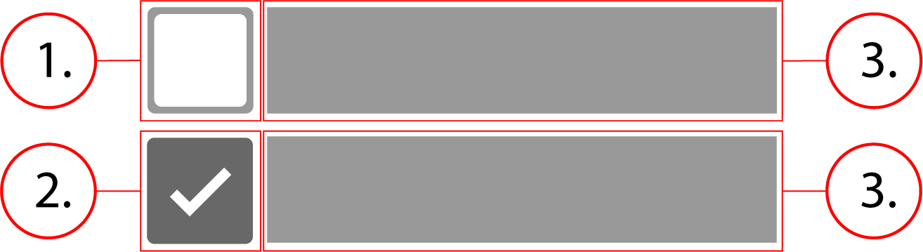
2. Checkbox checked
3. Option label
Behavior
Checkboxes are inline-flex, which means that they stretch horizontally to fit the content of their label, and then overflow onto the next line when there is no longer any room for more of them.
Checkbox - Implementation
Checkboxes allow users to select multiple options from a set.
Implementation
Below is what the Implementation of a single checkbox would look like, along with the html and css.
<div class="checkbox">
    <input class="checkbox__native-control" id="checkbox-1" name="recipienttype" type="checkbox" value="Spencer's account holder"/>
    <div class="checkbox__background" />
    <label class="checkbox__label" for="checkbox-1">
        Spencer's account holder
    </label>
</div>.checkbox {
display: inline-flex;
align-items: center;
line-height: 1;
position: relative;
margin: 0 8px 8px 0;
cursor: pointer
}
.checkbox__native-control {
position: absolute;
top: 0;
left: 0;
width: 100%;
height: 100%;
margin: 0;
padding: 0;
cursor: inherit;
opacity: 0
}
.checkbox__background {
position: relative;
border-radius: 2px;
border: 2px solid rgba(0, 0, 0, .54);
width: 20px;
height: 20px;
pointer-events: none;
background-color: transparent;
transition: border-color 90ms 0s cubic-bezier(0, 0, .2, 1), background-color 90ms 0s cubic-bezier(0, 0, .2, 1)
}
.checkbox__background:before {
content: '';
position: absolute;
width: 6px;
height: 2px;
background-color: #fff;
transform: rotate(45deg);
top: 9px;
left: 1px;
opacity: 0
}
.checkbox__background:after {
content: '';
position: absolute;
width: 12px;
height: 2px;
background-color: #fff;
top: 7px;
left: 3px;
transform: scaleX(0) rotate(0);
transition: opacity 90ms 0s cubic-bezier(.4, 0, .6, 1), transform 120ms 0s
}
.checkbox__native-control:checked+.checkbox__background:before {
opacity: 1
}
.checkbox__native-control:checked+.checkbox__background:after {
transform: scaleX(1) rotate(-45deg)
}
.checkbox__native-control:checked+.checkbox__background {
background-color: #4877da;
border-color: #4877da
}
.checkbox__native-control:focus+.checkbox__background,
.checkbox__native-control:hover+.checkbox__background {
border-color: #000
}
.checkbox__label {
padding: 0 8px
}Implementing a checkbox group
<fieldset aria-errormessage="form-message" class="checkbox-group">
<div class="checkbox">
<input class="checkbox__native-control" id="checkbox-1" name="1" type="checkbox" value="Option 1"/>
<div class="checkbox__background" />
<label class="checkbox__label" for="checkbox-1">Option 1</label>
</div>
<div class="checkbox">
<input class="checkbox__native-control" id="checkbox-2" name="2" type="checkbox" value="Option 2"/>
<div class="checkbox__background" />
<label class="checkbox__label" for="checkbox-2">Option 2</label>
</div>
<div class="checkbox">
<input class="checkbox__native-control" id="checkbox-3" name="3" type="checkbox" value="Option 3"/>
<div class="checkbox__background" />
<label class="checkbox__label" for="checkbox-3">Option 3</label>
</div>
</fieldset>.checkbox-group {
border: none;
display: flex;
margin: 8px 0;
flex-flow: row wrap;
padding: 0
}
.checkbox {
    display: inline-flex;
    align-items: center;
    line-height: 1;
    position: relative;
    margin: 0 8px 8px 0;
    cursor: pointer
}

.checkbox__native-control {
    position: absolute;
    top: 0;
    left: 0;
    width: 100%;
    height: 100%;
    margin: 0;
    padding: 0;
    cursor: inherit;
    opacity: 0
}

.checkbox__background {
    position: relative;
    border-radius: 2px;
    border: 2px solid rgba(0, 0, 0, .54);
    width: 20px;
    height: 20px;
    pointer-events: none;
    background-color: transparent;
    transition: border-color 90ms 0s cubic-bezier(0, 0, .2, 1), background-color 90ms 0s cubic-bezier(0, 0, .2, 1)
}

.checkbox__background:before {
    content: '';
    position: absolute;
    width: 6px;
    height: 2px;
    background-color: #fff;
    transform: rotate(45deg);
    top: 9px;
    left: 1px;
    opacity: 0
}

.checkbox__background:after {
    content: '';
    position: absolute;
    width: 12px;
    height: 2px;
    background-color: #fff;
    top: 7px;
    left: 3px;
    transform: scaleX(0) rotate(0);
    transition: opacity 90ms 0s cubic-bezier(.4, 0, .6, 1), transform 120ms 0s
}

.checkbox__native-control:checked+.checkbox__background:before {
    opacity: 1
}

.checkbox__native-control:checked+.checkbox__background:after {
    transform: scaleX(1) rotate(-45deg)
}

.checkbox__native-control:checked+.checkbox__background {
    background-color: #4877da;
    border-color: #4877da
}

.checkbox__native-control:focus+.checkbox__background,
.checkbox__native-control:hover+.checkbox__background {
    border-color: #000
}

.checkbox__label {
    padding: 0 8px
}
Contents