Select Boxes - Design
Select boxes display options in a collapsible format
Live Demo
Usage
Select boxes are very similar in purpose to radio buttons, but have a different use case. If you want users to be comparing the options then radio buttons work better because they are easier to see. If they are just selecting an option from a list, then a selection box should be used. A great example of when to use a select box would be for selecting what state you live in. Whereas if you were selecting what color you wanted something, radio buttons make more sense because the options are more easily compared. However, select boxes can still be used in place of radio buttons if the you need the options to be collapsible. It is also a good idea to use a select box when you have too many options for radio buttons to make sense.
Anatomy
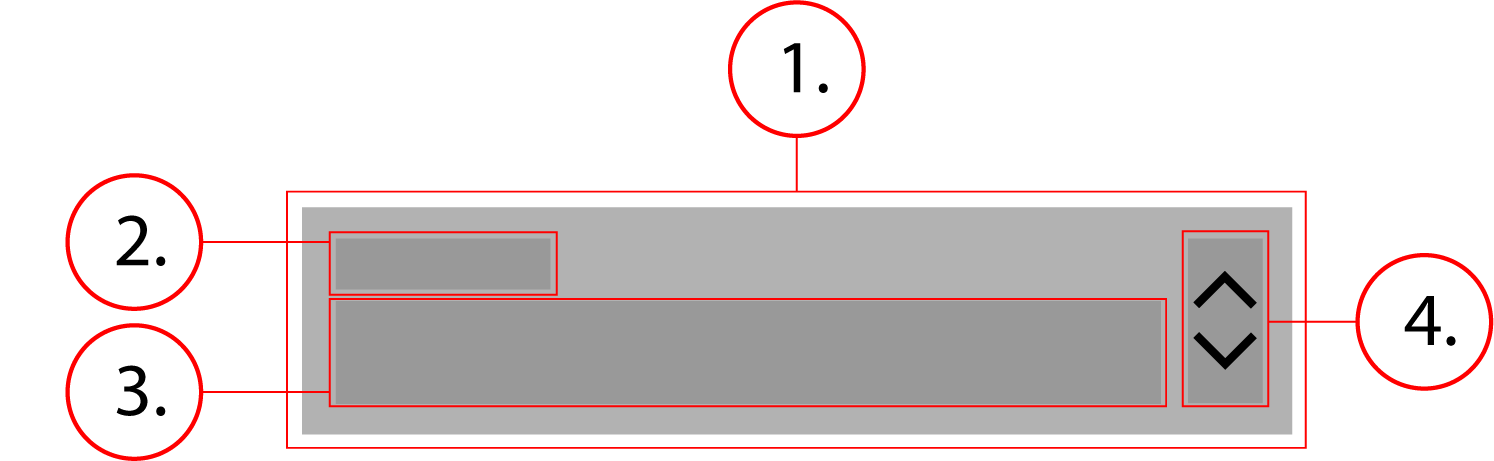
2. Label
3. Option Text
4. Icon
Behavior
The select box stretches horizontally to fit its container, its height does not change. When clicked, a menu appears displaying options.
Select Boxes - Implementation
Select boxes display options in a collapsible format
Implementation
<div class="dropdown">
    <select aria-invalid="false" aria-required="true" autocomplete="address-level1" class="dropdown__native-control" id="form-state" name="state" required="">
        <option style="display:none"/>
        <option value="CA">California</option>
    </select>
    <label class="textfield__label textfield__label--float-above" for="form-state" id="form-state-label">State</label>
    <div class="textfield__message" aria-live="assertive" id="form-state-message" role="alert"></div>
</div>.dropdown {
position: relative;
display: flex;
flex-flow: column nowrap;
margin: 0 0 8px
}
.dropdown__native-control {
-webkit-appearance: none;
appearance: none;
outline: 0;
color: #212121;
font-size: 1rem;
font-weight: 400;
line-height: 1rem;
letter-spacing: .04em;
border: 1px solid;
border-color: #949499;
border-radius: 3px;
background-color: #fff;
height: 48px;
width: 100%;
min-width: 88px;
padding: 14px 8px 4px;
background-image: url("data:image/svg+xml,%3Csvg xmlns='http://www.w3.org/2000/svg' width='24' height='24' fill='%23212121' viewBox='0 0 24 24'%3E%3Cpath d='M12 18.17L8.83 15l-1.41 1.41L12 21l4.59-4.59L15.17 15M12 5.83L15.17 9l1.41-1.41L12 3 7.41 7.59 8.83 9 12 5.83z'%3E%3C/path%3E%3C/svg%3E");
background-repeat: no-repeat;
background-position: right
}
.dropdown__native-control:-moz-focusring {
color: transparent;
text-shadow: 0 0 0 #000
}
.dropdown__native-control::-ms-expand {
display: none
}
.dropdown__native-control:hover {
cursor: pointer;
border-color: #000;
box-shadow: inset 0 0 0 1px #000
}
.dropdown__native-control:focus {
border-color: #3367d6 #285bc7 #2451b2;
box-shadow: inset 0 0 0 1px #2451b2
}
.textfield__label {
color: #6d6e71;
font-weight: 500;
line-height: 1;
cursor: text
}
.textfield__label--float-above {
position: absolute;
top: 4px;
left: 0;
font-size: 12px
}
.dropdown .textfield__label--float-above {
left: 8px
}