Dialog - Design
Dialogs inform users about a task and can contain critical information, require decisions, or involve multiple tasks.
Live Demo
Usage
A dialog is a type of modal window that appears in front of app content to provide critical information or ask for a decision. Dialogs disable all app functionality when they appear, and remain on screen until confirmed, dismissed, or a required action has been taken. Dialogs are purposefully interruptive, so they should be used sparingly.
Anatomy
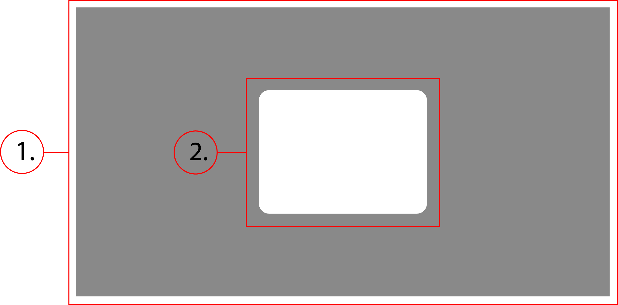
2. Dialog Container
Behavior
Dialogs have two main parts, the scrim and the container. The scrim is the transparent background that disables the rest of the site, and the container is the dialog that appears on top. The scrim takes up 100% view height and width and is fixed position. The dialog container scales to fit the content of itself, and appears centered in the screen.
Dialog - Implementation
Dialogs inform users about a task and can contain critical information, require decisions, or involve multiple tasks.
Implementation
<button id="demoDisclosure">Demo</button>
<div class="dialog" id="demo">
    <div class="dialog__panel" role="dialog" aria-modal="true" aria-label="Example dialog" aria-details="This is an example dialog" id="dialog__panel">
        <div class="dialog__actions">
            <button id="dismiss">Close</button>
            <button style="background-color: #44f; color: #fff; border: none;">Confirm</button>
        </div>
    </div>
</div>
<script>
    class Dialog {
        constructor(props) {
            this.dialog = props.dialog;
            this.panel = this.dialog.querySelector(".dialog__panel");
            this.dismiss = this.dialog.querySelector("#dismiss");
            this.disclose = document.querySelector("#" + this.dialog.id + "Disclosure")
            this.tabbableElements = this.getKeyboardFocusableElements(this.panel);
            this.lastTabbableElement = this.tabbableElements[this.tabbableElements.length-1];
            this.lastFocusedElement = null;
            this.title = this.panel.ariaLabel;
            this.details = this.panel.getAttribute("aria-details");

            this.open = this.open.bind(this);
            this.close = this.close.bind(this);
            this.handleKeydown = this.handleKeydown.bind(this);

            this.disclose.addEventListener("click", this.open)
        }
        open() {
            if (!this.title || !this.details) {console.error("Error: Either aria-label or aria-details is missing. Please fill these out to meet web accessibility standards."); return;}
            this.dialog.style.display = "flex";
            document.body.style.overflow = "hidden";
            this.lastFocusedElement = document.activeElement;
            this.tabbableElements[0].focus()
            this.dismiss.addEventListener("click", this.close)
            document.body.addEventListener("keydown", this.handleKeydown)
        }
        close() {
            this.dialog.style.display = "none";
            document.body.style.overflow = "inherit";
            this.dismiss.removeEventListener("click", this.close)
            document.body.removeEventListener("keydown", this.handleKeydown)
            this.lastFocusedElement.focus()
        }
        getKeyboardFocusableElements(elem) {
            return Array.from(elem.querySelectorAll('a[href], button, input, textarea, select, details,[tabindex]:not([tabindex="-1"])'))
            .filter(el => !el.hasAttribute('disabled') && !el.getAttribute('aria-hidden'));
        }
        handleKeydown(event) {
            if (event.key == 'Esc' || event.key == 'Escape') {
                this.close();
            }

            if (event.key == 'Tab') {
                if (!event.shiftKey && document.activeElement == this.lastTabbableElement) {
                    event.preventDefault();
                    this.tabbableElements[0].focus();
                }

                if (event.shiftKey && document.activeElement == this.tabbableElements[0]) {
                    event.preventDefault();
                    this.lastTabbableElement.focus();
                }
            }
        }
    }
    document.querySelectorAll(".dialog").forEach(element => {
        new Dialog({dialog:element})
    })
</script>
First off, the HTML. This implementation of a dialog uses a button as a disclosure, but you could change this to use some other method of disclosure. The button associated with the dialog needs to have and id that follows this format: "dialog id"+"Disclosure". The other notable properties of the HTML are the aria attributes. The attributes "role", "aria-modal", "aria-label", and "aria-details" are all important for meeting accessibility standards. The role can be set to either "dialog" or "alertdialog". "dialog" should be used if its just a standard dialog, and "alertdialog" should be used if the dialog is for some kind of important information or critical alert. "aria-modal" should always be true, because dialogs are a type of modal. "aria-label" and "aria-details" give screenreaders vital context on what it is the user is viewing. The "aria-label" should be set to a title that describes the content of the dialog, such as "Confirmation". And "aria-details" should be set to a text description of what is happening in the dialog, such as "Are you sure you want to remove from cart?" The javascript here may look like a lot for a popup, but this is because it handles tabindex in order to follow web accessibility design patterns. When a dialog is opened, the user should no longer be able to interact with or tab to elements outside of the dialog. The script traps the focus of the user inside the dialog, and also sets the focus of the user back to the last element they had focused when the dialog opened. At the bottom of the script, just outside the Dialog class, there is a for loop that automatically creates a dialog object for every element that has a class of "dialog".
CSS
.dialog {
    position: fixed;
    z-index: 1000;
    top: 0;
    left: 0;
    width: 100vw;
    height: 100vh;
    background-color: rgba(0,0,0,.5);
    display: none;
    align-items: center;
    justify-content: center;
}
.dialog__panel {
    width: 75%;
    min-height: 50px;
    padding: 10px;
    background-color: #fff;
    border-radius: .3rem;
    box-shadow: 0 0 20px 1px rgba(0,0,0,.5);
}
@media only screen and (min-width: 720px) {
    .dialog__panel {
        width: fit-content;
        min-width: 10%;
    }
}